Why Your Website Gets Traffic But No Leads
A practical look at how one growing business discovered that generating more traffic would not solve its lead problem—and what needed to change before its website could support growth.
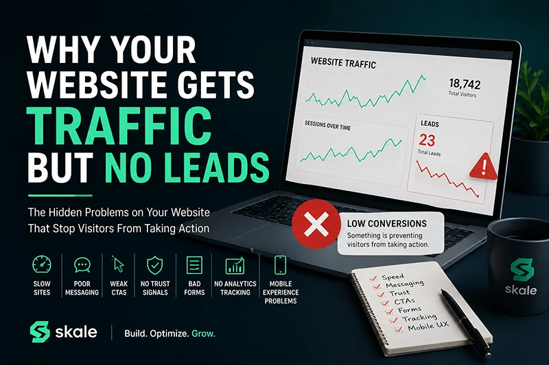
The business in this case study did not have a traffic problem.
Its website was receiving visitors from search engines, paid advertising, social media, referrals, and existing customers. Traffic reports looked encouraging. Campaigns were generating clicks. People were reaching the site.
But very few of those visitors contacted the company.
The contact form received an occasional submission, but not enough to justify the amount being spent on marketing. The natural reaction was to question the advertising. Should the company spend more? Try different audiences? Increase its search engine optimization efforts?
A closer review revealed a different problem: the website was receiving attention, but it was not helping visitors understand, trust, or take the next step with the business.
More traffic does not automatically create more leads.
Sending additional visitors to a website that does not convert often increases marketing costs without fixing the underlying problem.
This case study uses a representative business scenario based on the conversion problems we regularly see on small and growing business websites. Your website may not have every issue described below, but even two or three of them can make a significant difference in how visitors respond.
The starting point
The website looked acceptable, but it was not doing its job
At first glance, nothing appeared seriously wrong. The website had a professional logo, descriptions of the company’s services, a few photos, and a contact page. It displayed properly on a desktop computer and had been online for several years.
The business owner assumed that visitors would review the services, recognize the company’s experience, and get in touch.
That assumption placed too much work on the visitor.
People arriving from a Google search or paid advertisement were not carefully studying every page. They were quickly deciding whether the business understood their problem, offered the right solution, and seemed trustworthy enough to contact.
In those first few moments, the website was creating uncertainty instead of confidence.
Problem
Slow load times created a poor first impression
The homepage used oversized images, unnecessary scripts, multiple tracking tools, and several third-party plugins. On a fast office connection, the delays were easy to overlook. On a mobile device or slower connection, the experience felt noticeably different.
Visitors clicked an advertisement expecting an immediate answer. Instead, they saw a partially loaded page, shifting content, or an empty area where the most important information should have appeared.
Some visitors left before they ever saw the offer.
What needed to change
- Large images were resized and compressed.
- Unused scripts and plugins were removed.
- Important page content was prioritized during loading.
- The site was reviewed on real mobile connections, not only desktop Wi-Fi.
- Performance was treated as part of the customer experience rather than a purely technical concern.
Website speed affects more than performance scores. It influences whether a visitor feels that the business is current, reliable, and prepared to serve them.
Problem
The messaging described the company, not the customer’s problem
The original homepage opened with a broad statement about quality, service, and experience. The language was not inaccurate, but it could have applied to almost any company in the industry.
Visitors had to read several paragraphs before understanding what the business actually did, who it served, and why its approach was different.
The website focused on statements such as:
“We provide innovative solutions and outstanding customer service.”
“Our experienced team is committed to exceeding expectations.”
Those statements sounded positive, but they did not help a visitor determine whether the company could solve a specific business problem.
What needed to change
The revised message started with the customer’s situation and the result the business could help create. It answered four questions quickly:
- What problem does the business solve?
- Who is the service for?
- What outcome can the customer expect?
- What should the visitor do next?
Clear messaging does not require exaggerated claims. It requires understanding what your customer is trying to accomplish and explaining how your business can help.
Problem
Weak calls to action left visitors without a clear next step
The website included a small “Contact Us” link in the navigation and another contact link near the bottom of the page. There was no clear invitation within the main content.
Even interested visitors had to decide where to go, what to ask, and what would happen after submitting the form.
A call to action should reduce uncertainty. It should tell the visitor what the next step is and make that step feel reasonable.
What needed to change
The generic contact links were supported by more specific invitations:
- Request a free website consultation.
- Ask us to review your current website.
- Discuss why your advertising is not generating inquiries.
- Find out which improvements should be prioritized first.
The calls to action appeared at logical points throughout the page instead of being hidden in one location. Visitors could act when they were ready without being pressured by constant popups or aggressive sales language.
Problem
There were not enough reasons to trust the business
The website repeatedly described the company as experienced and dependable, but it provided little evidence to support those statements.
There were no customer stories, no examples of completed work, no explanation of the company’s process, and no indication of what clients could expect after making contact.
This matters because contacting a new business involves risk. A visitor may be wondering:
- Does this company understand businesses like mine?
- Will someone respond?
- Will I be pressured into buying something?
- Can this team handle the work?
- What makes this company different from the other options I opened?
What needed to change
The revised website added proof throughout the customer journey:
- Relevant testimonials and customer feedback.
- Examples of previous work and business outcomes.
- A simple explanation of the consultation and project process.
- Clear contact information and business details.
- Answers to common questions and concerns.
- Consistent design, writing, and branding across the site.
Trust is not created by adding one testimonial slider. It comes from removing uncertainty throughout the entire website.
Problem
The contact form made starting a conversation feel like work
The contact form asked for a name, company, job title, phone number, full address, service category, estimated budget, project timeline, and a detailed explanation of the project.
That information could be useful later, but it was too much to request from someone who had only recently discovered the business.
The form also had several usability problems. Error messages were unclear, the submit button was easy to miss, and mobile users had to scroll through too many fields.
What needed to change
The initial form was simplified to collect only the information required to begin a useful conversation:
- Name
- Email address
- Phone number, when appropriate
- A short description of what the visitor needs help with
The form also explained what would happen after submission. Visitors knew that someone would review their message, respond personally, and use the first call to understand the situation—not deliver a scripted sales presentation.
Problem
Analytics showed visits, but not what visitors were doing
The business knew how many people visited the website, but it could not answer more useful questions:
- Which campaigns generated qualified inquiries?
- Which landing pages caused visitors to leave?
- Did people begin the contact form and abandon it?
- Were visitors clicking phone numbers or email links?
- Which devices produced the most conversions?
- How many inquiries became actual customers?
Without conversion tracking, decisions were being made using traffic totals rather than business outcomes.
What needed to change
The measurement plan was rebuilt around meaningful actions. Tracking was configured for form submissions, calls, important button clicks, landing-page performance, campaign sources, and other steps connected to lead generation.
Reporting was also simplified. Instead of presenting a large collection of disconnected numbers, reports focused on what was working, what was underperforming, and what should be tested next.
Good analytics reporting does not merely describe the past. It should help the business decide what to do next.
Problem
The mobile website technically worked, but it was difficult to use
The website adjusted to smaller screens, so it was considered mobile responsive. That did not mean it provided a good mobile experience.
Headlines wrapped awkwardly. Buttons were too close together. Important information appeared far down the page. The form was tedious to complete, and the phone number was not easy to tap.
These problems were especially damaging to paid advertising. Many visitors arrived from social media on their phones, encountered a page designed primarily for desktop screens, and left.
What needed to change
- The most important message appeared near the top of the mobile page.
- Buttons became larger, clearer, and easier to tap.
- Long sections were simplified for scanning.
- Forms used appropriate mobile input types.
- Phone numbers and email addresses became directly actionable.
- The full lead journey was tested on several screen sizes.
Mobile optimization is not the act of making a desktop design smaller. It requires deciding what a mobile visitor needs first and removing anything that gets in the way.
The turning point
The business stopped asking, “How do we get more traffic?”
The more useful question became:
“What prevents the people already visiting our website from taking the next step?”
That changed the order of priorities.
Instead of immediately increasing the advertising budget, the business improved the experience receiving that traffic. The website was made faster, the message became more specific, calls to action were clarified, trust was strengthened, forms were simplified, and conversion tracking was added.
Search engine optimization and paid advertising still mattered. However, they became parts of a larger system rather than isolated attempts to generate clicks.
A lead-generating website requires more than web design
Website performance problems rarely fit neatly into one service category. A site may need technical development, clearer positioning, better search visibility, more focused advertising, stronger conversion paths, and more accurate reporting.
These areas need to work together:
Website Development
Builds the technical foundation for a fast, accessible, responsive, and maintainable website.
Conversion Optimization
Identifies the messaging, design, usability, and process issues preventing visitors from becoming leads.
SEO
Helps the right people discover useful pages when they are actively searching for answers and services.
PPC Solutions
Connects focused advertisements with landing pages designed around the visitor’s intent.
Analytics Reporting
Shows which channels, pages, and actions contribute to inquiries and business opportunities.
Digital Marketing
Coordinates search, paid advertising, content, and other channels around a consistent growth strategy.
Does this sound like your website?
You may not need more traffic yet. Your first priority may be improving what happens after people arrive.
Look for these warning signs:
Traffic is increasing, but inquiries remain flat.
Paid campaigns generate clicks but few form submissions.
Visitors cannot quickly explain what makes your company different.
Your website is noticeably slower on mobile devices.
Your forms ask for more information than your team initially needs.
You cannot connect website activity to real sales opportunities.
Your most important call to action is easy to miss.
The site describes your services but not the customer’s problem.
Your website should help people make a confident decision
A website cannot force someone to become a customer, and it should not try to.
Its job is to help the right visitor understand the problem you solve, recognize the value of your approach, trust your business, and take a reasonable next step.
When that process breaks down, adding more traffic usually magnifies the problem. You pay for more people to encounter the same confusion, delays, weak messaging, and difficult forms.
The answer may involve a complete website redesign, but it may not. Sometimes the most valuable improvements are focused changes to performance, content, page structure, calls to action, forms, tracking, or mobile usability.
The first step is understanding where the experience is failing.
Free Website Consultation
You may not need more traffic. You may need a better path from visitor to lead.
Skale can review your website, marketing, conversion paths, and tracking to help identify what may be preventing visitors from contacting your business.
The consultation is a practical conversation about your website and goals. There is no obligation, and you do not need to know which service you need before reaching out.
Related Services